spent way too long on a classic styled gta 6 cover
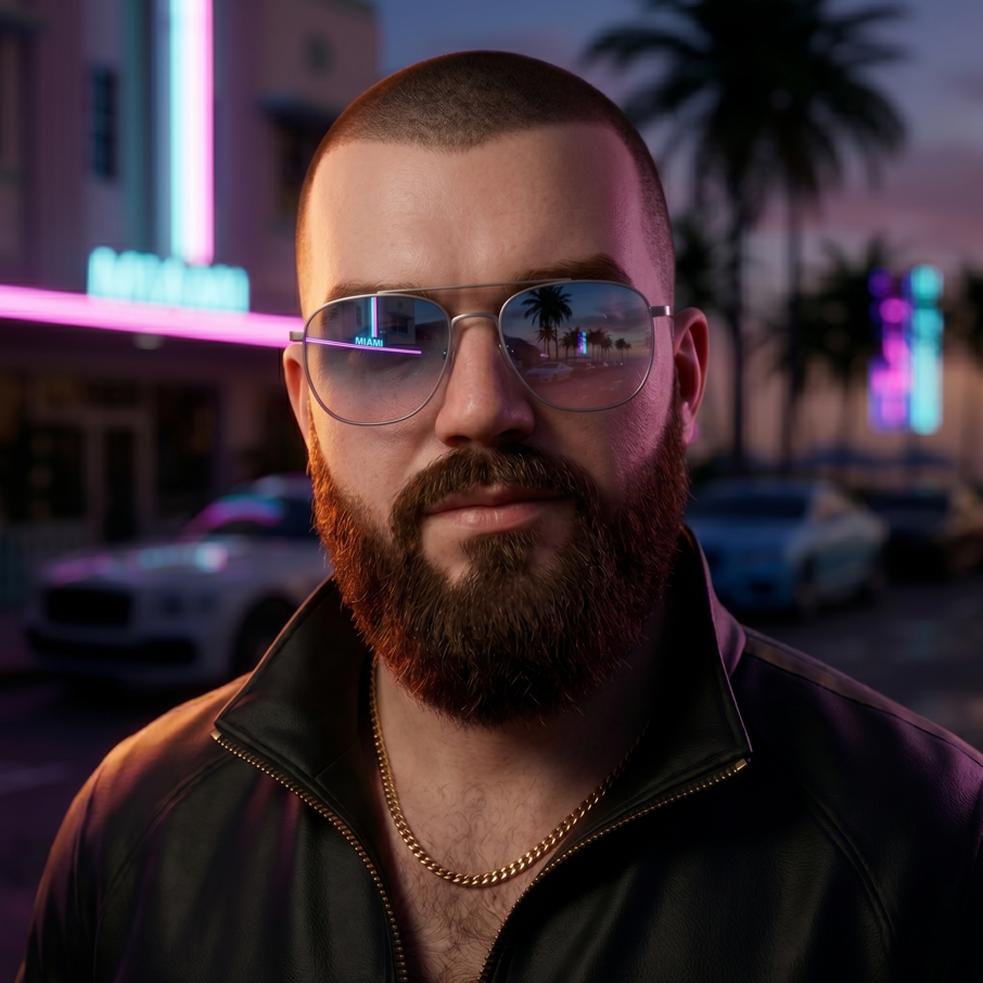
Been working on this classic styled GTA 6 cover for a while now and figured I'd share it here. The logo was originally done by Takiva2006 over on Deviantart, but I went in and made the vertical lines more angular and thickened everything up. Also did a white variant in the Vice City Stories style and an ultimate gradient version.
Adjusted the aspect ratio so it lines up with the standard Rockstar website format. Moved a few elements around to match how the older covers were laid out, and threw in a custom Rockstar logo that's inspired by the Sony app icon. Took longer than I expected but it finally feels right.
I've always liked how the classic covers had that specific energy, the bold lines and the way the art wraps around the logo. Seeing GTA 6 get that treatment makes the wait feel a little more real. The gradient one is my favorite, it pops more than the white version but both have their place.
This is my small contribution and I'm happy with how it turned out.
Source: r/GTA6 · Curated content.
Got a take on this?
Join the discussion. It takes about thirty seconds, and you can reply to any thread on the forum.