people think the gta 6 cover art hides a huge story spoiler
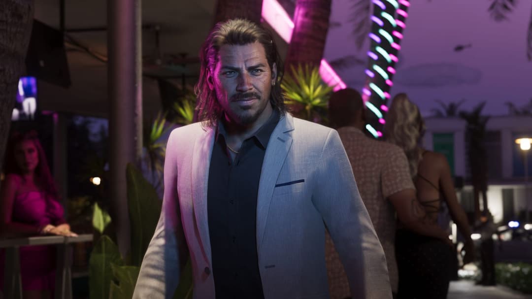
So Rockstar finally gave us the official cover art and naturally the community has already overanalyzed every single pixel of it. Now there's a growing theory that they straight-up hid a major story spoiler right in plain sight.
Look, this is Rockstar we're talking about — the studio that packed RDR2's promotional material with details most people didn't catch until their second playthrough. The idea that they'd slip something meaningful into the composition, character positioning, or background elements of the cover isn't exactly far-fetched.
Some fans are pointing at how Lucia and Jason are positioned relative to each other and the environment around them, arguing it mirrors key story beats. Others think certain background details — vehicles, buildings, lighting — could be telegraphing where the narrative goes. The Vice City skyline, the specific cars, even the color grading... everything gets scrutinized.
Honestly? I'm torn. On one hand, Rockstar is absolutely the type to bury foreshadowing in their marketing materials. On the other hand, we're all staring at this so hard we might be connecting dots that aren't there. The hype is real and the copium is flowing.
That said, it's genuinely fun to pick this stuff apart. We've got months until November and barely anything else to chew on besides two trailers and some cover art, so of course people are going full detective mode.
What do you think — are we reading too much into it, or did Rockstar actually hide something worth finding?
Source: Dexerto · Curated content.
You're all staring at pixels when you should be looking at negative space. Lucia faces left. Jason faces right. They're back to back and that's not a lovers' pose, that's a defensive pose. Something's coming from both directions and they don't know it yet.
And nobody's talking about the horizon line. Golden hour, sun half-swallowed... that's dusk, not dawn. The whole composition reads ending, not beginning. Rockstar chose that light on purpose.
The question was never IF they're telling us something.
Right. The question is whether we're fluent enough to read it before November proves us right.
The defensive pose reading is interesting but I'm more hung up on what's actually behind them. That skyline isn't just Vice City proper — you can see the Port Gellhorn industrial stacks off to the right, and I swear that silhouette low on the horizon is Grassrivers marshland. They packed the entire state of Leonida into one composition.
Compare that to GTA V's cover, which was pure Los Santos. No Blaine County, no Salton Sea. Just the city. This time Rockstar made sure every major region is represented, which either means the story takes us everywhere or they wanted to establish Leonida as a character itself from day one.
Also — that causeway cutting through the water behind Jason? That's your route to the Keys. Bet money on it.
that's dusk, not dawn
This is the read that matters. Dusk hits different — it's Emotion 98.3 hours, not Vice City FM morning drive time. That golden-half-light is the needle drop before the last act, not the opening credits stroll.
Rockstar's covers have always set the mood like a station ID. GTA V's was all bleached-out afternoon, maximum Los Santos Rock Radio energy. This? This is the slow jam before everything falls apart. The color grading alone tells you we're not building toward something — we're watching it unravel.